How to Make a Facebook Ad That Actually Converts

The hard part of how to make a Facebook ad isn't the publish button, it's the creative. The ad, the image, and the copy decide whether someone stops or scrolls past. And the fastest way to get it right isn't inventing from scratch, it's starting from structures that already proved they work and filling them with your own.
Why the creative decides everything
Before we talk templates, understand where the lever is. The team at Common Thread Collective argues that creative is the primary performance lever, to the point of stating that "56% of all outcomes on Meta are driven solely by creative." In other words, more than half of your result depends on what people see, not on targeting.
That changes where you spend your time. Instead of fighting with segmentation, most of your effort should go into producing good creatives and testing them at volume.
Start with a static, not a video
To sell faster, the static is your workhorse. It's cheap, produces in hours, and depends on no one external.
Motion documents this in its static ads playbook: statics enable high creative volume with no dependency on shoots or editing. Ashvin Melwani of the brand Obvi sums it up, via Motion: "In the past year, we've done a total of three video ads. The rest is static."
The practical upside is twofold. You produce more pieces per week and you can iterate fast when one fatigues. That pace matters: Common Thread Collective insists that beating creative fatigue takes consistent volume and fast iteration.
The anatomy of an ad that converts
A Facebook ad has fixed parts, and each has a job. Shopify, in its Facebook ad copy guide, describes the anatomy and reminds us that the best ads name and solve a specific pain point, with social proof and a touch of urgency.
| Element | Approx. length | Job |
|---|---|---|
| Primary text | ~125 characters | Hook and name the pain |
| Headline | ~40 characters | Close with the benefit |
| Description | ~30 characters | Reinforce or add context |
| CTA | Button | Say what to do now |
The visual creative carries just as much weight. Tinuiti, in its ad design best practices, recommends designing for the platform's specs and context, staying concise, and using a limited 2-3 color palette with strong contrast to stop the scroll.
Tinuiti's own ad tests put numbers on this:
- A 6-second ad drove "a 50% lower CPE and a 32% higher CTR" versus a 15-second one. Short wins.
- Ad creative with customer reviews saw "CPC decreased by 26%, CTR increased by 19%, ROAS… 110%." Social proof inside the creative pays off.
If you want the full piece-by-piece breakdown, see our guide on the winning static ad formula.
Start from a benchmark, not a blank page
Here's the shortcut. Instead of inventing the structure, take a reference ad that already works in your category and use it as a mold. We call that proven mold a benchmark.
The benchmark gives you the FORM: the layout, the visual hierarchy, the copy formula, where the hook goes and where the CTA lands. Your brand supplies the SUBSTANCE: your message, your product, your voice, your colors. Copying the message makes you a blurry version of someone else; reusing the structure saves you the most uncertain part of the process.
Where do benchmarks come from? From watching what has been running for a while in your market. That's where the Meta Ad Library comes in: a public archive where you can see which ads your competitors keep alive, which is the most honest signal of what converts.
Two real examples, made with Marketools:
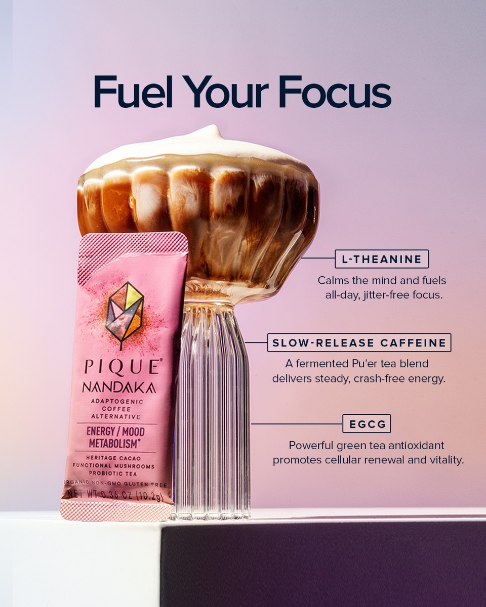
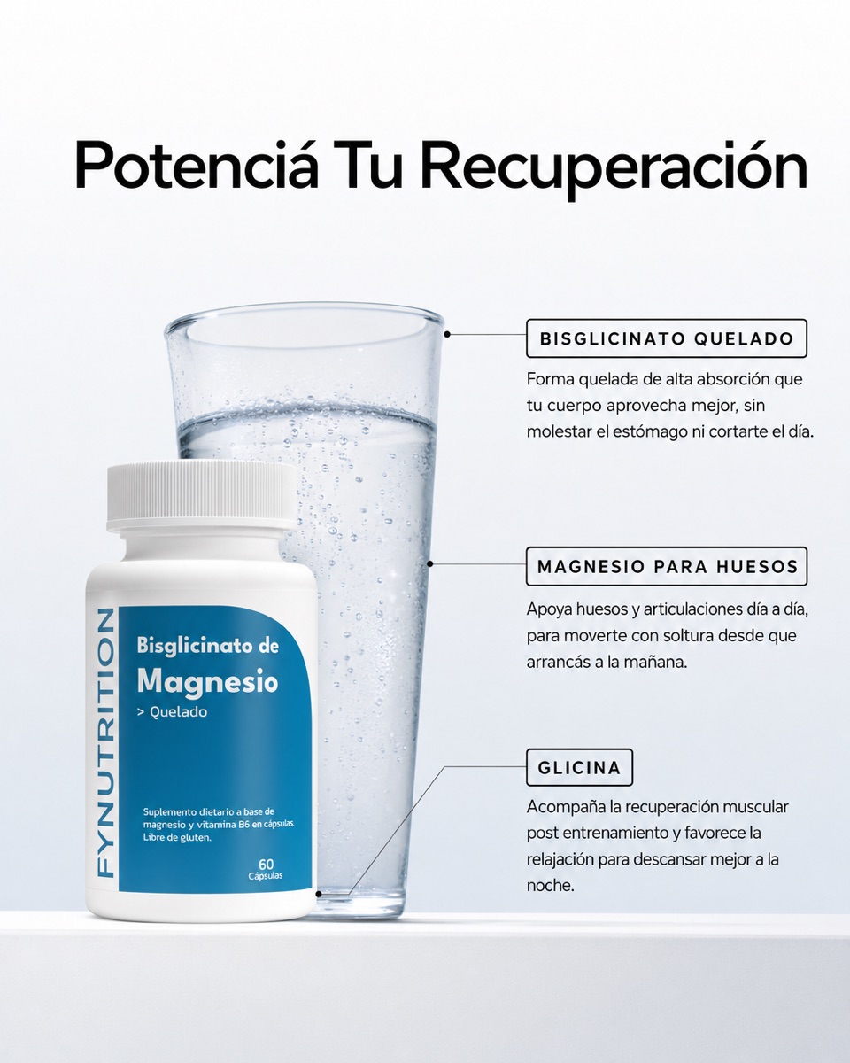
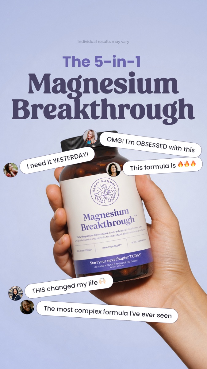
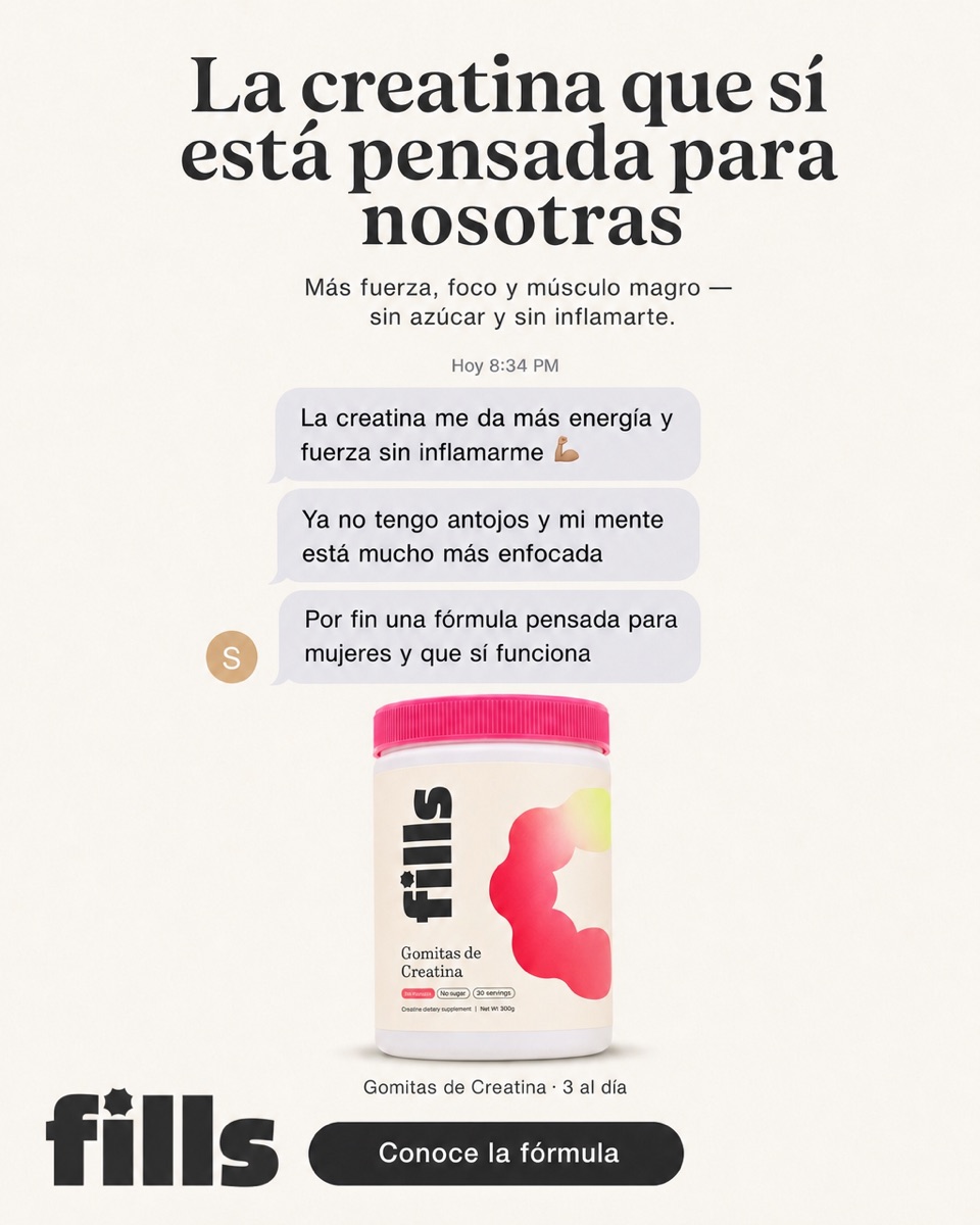
How to build it, step by step
- Pick a benchmark. In the Meta Ad Library, find an ad in your category that has been live for weeks.
- Identify the structure. Is it a before/after, a benefit list, a highlighted review, a comparison?
- Swap the substance. Replace the message with your angle, the product with yours, the colors with your brand's.
- Respect the specs. Feed and story formats, a 2-3 color palette, text legible on a small screen.
- Produce several variants. Change the hook or headline so you have something to test.
- Publish, measure, repeat. Let it run, cut what doesn't land, double down on what does.
The Marketools Spy Center does exactly this automatically: it takes an ad from Meta's public library, keeps the winning structure, and rebuilds it with your brand in one click, ready for feed and story.
FAQ
How do I make a Facebook ad without a designer?
Start from a proven structure and swap only the message, product, and colors. Tools like Marketools rebuild a benchmark with your brand without you touching a design editor.
Is a static or a video better?
To start and for volume, the static. It's cheaper, produces faster, and lets you test more ideas per week, as Motion documents. Video comes later, not at the start.
How much text should the ad have?
Little. Primary text runs around 125 characters and the headline about 40. Tinuiti shows that concise performs better; let the image and one clear idea do the work.
Will copying a competitor's ad work for me?
Copying the message won't. What you reuse is the structure that already proved it works; the message and voice have to be yours for the ad to connect with your audience.
Making a Facebook ad stops being a blank canvas when you start from what already works in your market. Marketools reads your store, rebuilds winning structures with your brand, and hands you statics ready for feed and story. Try it here.
Sources
This article draws on industry sources: